In the Brand Identity unit, we learned what brand identity is, then we applied what we learned to make our own brand that represents us.
The first step was to learn what a brand represents. I started by doing a brand analysis. Then, I designed a logo, and finally, the style guide.
Brand Analysis
I chose to do a brand analysis about the logo of US Open. I analyzed both of their new logo and their old logo. Then, I compared them and analyzed why the new logo was better.
Logo Design
I wanted to design a logo that represents my idea of a simple and playful design. I started brainstorming my logo by thinking of any arrangement of my name and initials.
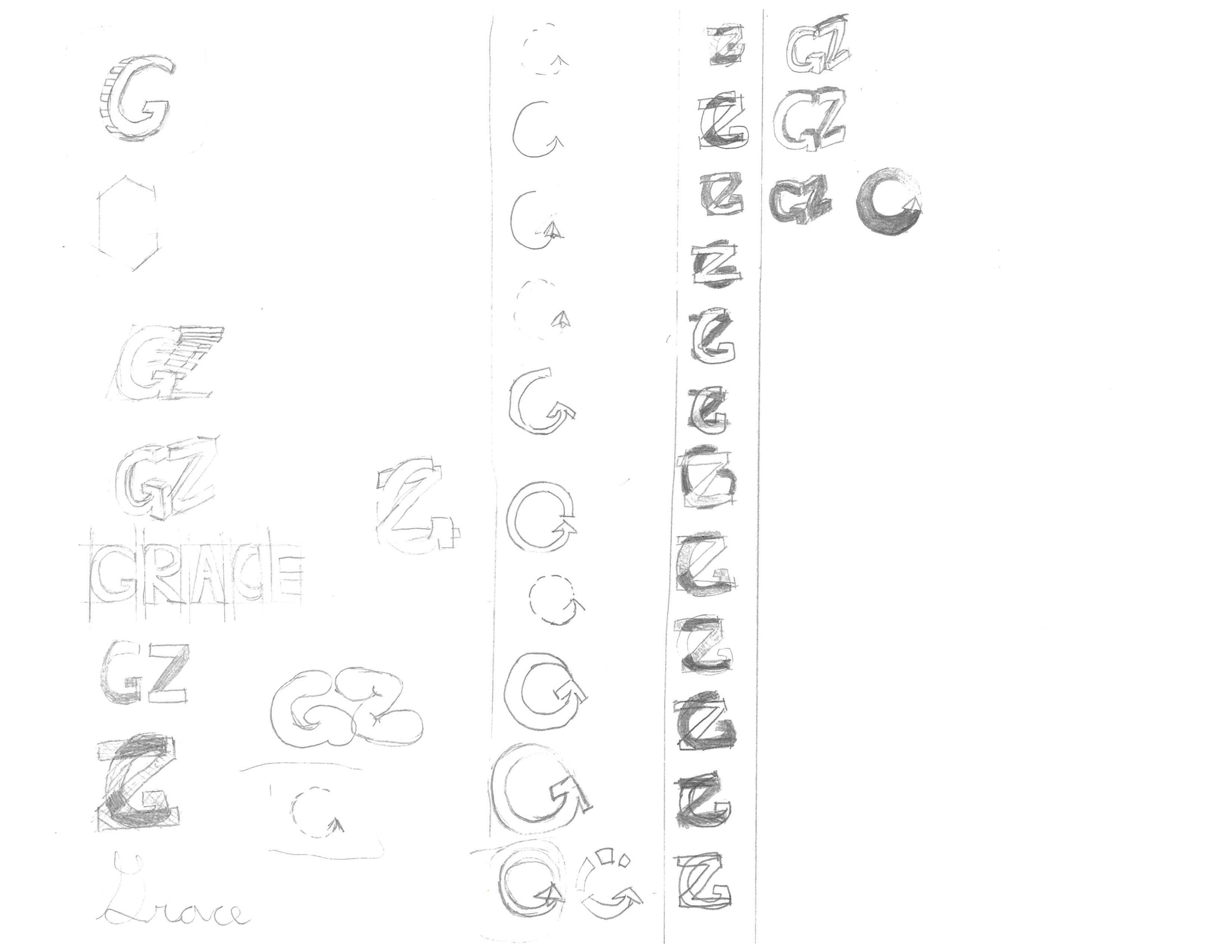
Then, I chose my favorite design and made different versions of it on Illustrator.

Finally, I settled on this logo:

Style Guide
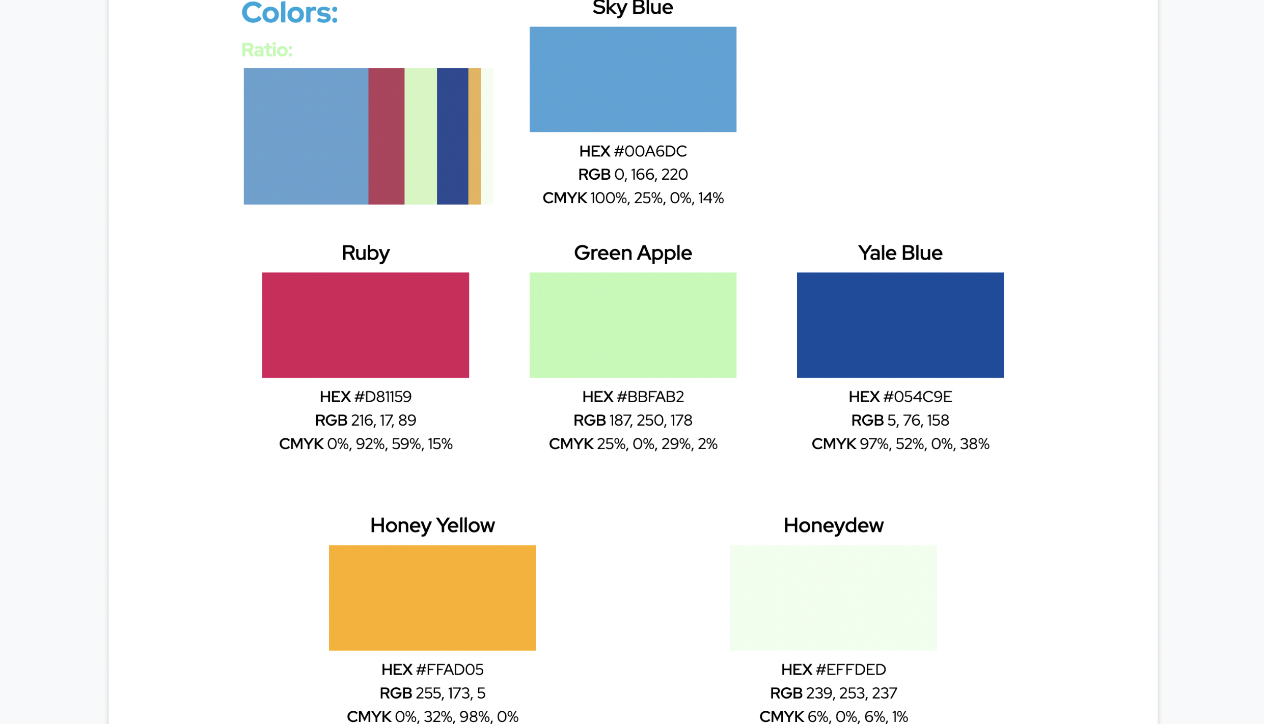
After I had my logo and two of my main colors, I then looked for colors that fit with the current colors I have. I used the website coolors.co, and it automatically generates colors that go well together.
After I found the color, I looked for fonts that fit my design philosophy. I wanted to use one serif font to represent my “modern” aesthetic, while I found a sans-serif font to represent my “formal” aesthetic. Tothether, these fonts will help emphesize certain parts of my website.
Finally, I put everything into a document and made a style guide.
Reflection
I learned a lot from making a logo and style guide based on my brand identity. As someone who is intrested in UI design, making an app/website aestheticly pleasing through consistency is important.
To improve my style guide, I think I should have chosen less colors and used the main color more often. This way, there would be more of a consistency.